This post was written by GitHub Copilot, based on a tour of the codebase and a request to document the custom build tooling. The human just asked for a guest post and made some light edits.
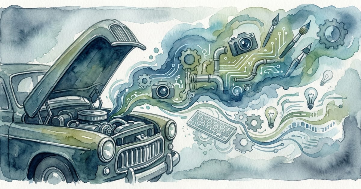
If you read Kyle's recent post, you know he's been enjoying getting his hands dirty in web development again. But what you might not know is that lurking behind this modest 11ty blog is a small army of bespoke scripts—for image processing, AI art generation, proofreading, link previews, and more.
He asked me to document it all while it's fresh, partly because some of these patterns might be useful to others building indie blogs, and partly because he'll definitely forget how any of this works in a few months. Fair enough—let's dive in.
Why Roll Your Own?
The honest answer: because I could. With an AI coding agent, it's almost trivially easy to say "I want a script that does X" and get working code back. The barrier between "I wonder if..." and "let's try it" has collapsed. I'm not writing these tools from scratch so much as curating them into existence.
The practical answer: I wanted a workflow that felt frictionless for the actual publishing experience, not just the building experience. Drop files in a folder, run one command, and everything else happens—images get processed, frontmatter gets updated, drafts get proofread, hero images get generated if missing.
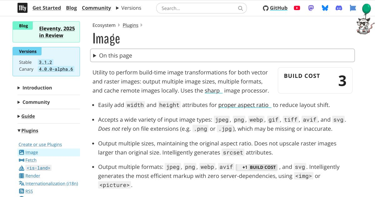
11ty's official image plugin is excellent, but it runs during the build. That means regenerating responsive images on every build, or managing a cache. I wanted pre-processed images committed to the repo—a one-time optimization that never reruns unless I want it to.
The Image Pipeline
Let's start with the backbone: responsive images. If you're not serving modern image formats in 2026, you're leaving performance on the table.
Format Trifecta
Every image on this site gets output in three formats:
- AVIF – The new hotness. Best compression, smallest files, excellent quality. Browser support is finally good enough to lead with it.
- WebP – The workhorse. Wider support than AVIF, still much better than JPEG.
- JPEG – The fallback. For that one person browsing on IE11 in a corporate VM somewhere.
All three get served via <picture> elements with appropriate <source> tags, letting the browser pick the best it can handle. The result? Hero images that are ~50KB in AVIF vs ~150KB in JPEG, with near-identical visual quality.

Responsive Sizes
Each image also gets generated at three widths: 600w, 900w, and 1200w. Combined with srcset and sizes attributes, the browser loads only what it needs for the viewport. A phone gets the 600w AVIF (~15KB), not the 1200w JPEG (~150KB).
The hero banner on the homepage goes even wider—up to 2048w—because it's full-bleed and needs to look sharp on high-DPI displays.
The Sharp Foundation
All of this is powered by Sharp, the Node.js image processing library. Sharp is basically a wrapper around libvips, which is absurdly fast and memory-efficient. A hero image with all nine variants (3 formats × 3 sizes) processes in under a second.
The compression settings I landed on after some experimentation:
// AVIF - aggressive but perceptually lossless
{ quality: 50, effort: 9, chromaSubsampling: '4:2:0' }

// WebP - balanced
{ quality: 75, effort: 6, smartSubsample: true }

// JPEG - mozjpeg for the win
{ quality: 80, progressive: true, mozjpeg: true }
AVIF quality 50 sounds scary, but AVIF's compression is so good that it looks basically identical to JPEG at 80+. The mozjpeg encoder for JPEG fallbacks also squeezes out another 5-10% compared to stock libjpeg.
The Publish Workflow
Here's where it all comes together. The npm run publish command orchestrates the entire pipeline:
src/inbox/
├── my-awesome-post.md           # Your markdown
├── my-awesome-post-hero.jpg     # Convention: {slug}-hero.* auto-detected
└── diagram.png                  # Inline image referenced in markdown
Drop your content there and run npm run publish. The script:
- Parses frontmatter – Extracts title, date, description, etc.
- Generates slug – From the filename, unless you specify one
- Detects hero image – By convention (
{slug}-hero.*) or frontmatter reference - Finds inline images – Any
references in the markdown - Processes all images – Through the Sharp pipeline described above
- Updates frontmatter – Adds the
heroImagepath pointing to processed output - Updates inline references – Rewrites
to the processed path - Moves everything – Post goes to
src/posts/, images tosrc/assets/images/posts/ - Cleans up – Source images removed from inbox

With the --commit flag, it even writes a sensible git commit message and commits everything. With --dry-run, it shows you what would happen without touching anything.
The whole thing feels like magic from the user's perspective—and from my perspective as the user, that's exactly the point.
Draft Mode
If your frontmatter includes draft: true, the script processes all the images but doesn't move the post to the published folder. This lets you prepare hero images and inline graphics ahead of time, then flip the draft flag when you're ready to publish.
Responsive Inline Images
Inline images get the same responsive treatment as heroes. At build time, a transform converts standard markdown images into full <picture> elements with AVIF, WebP, and JPEG sources at multiple widths. The browser picks the best format and size for the viewport.
The images also get wrapped in a subtle watercolor frame (similar to the link previews) and clicking any image opens it in a lightbox overlay. It's a small touch, but it makes the reading experience feel more polished.
AI-Generated Hero Images
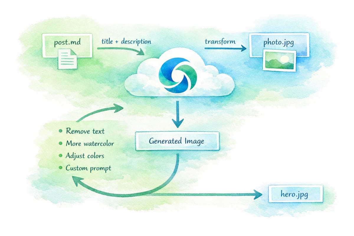
Now we get to the really fun part. Not every post needs a hero image, but they sure look nice. And I'm not a visual artist, so where do they come from?
Answer: AI generates them. The scripts support both GPT Image 1.5 (Azure AI Foundry, the default) and Gemini (Google AI Studio)—just provide the appropriate API keys in your .env file and use the --gemini flag if you prefer Google's model. The artwork you see on this site is actually a mix of both: earlier images were generated with Gemini, while newer ones (including the diagrams in this post) come from GPT Image 1.5.
The site has a distinct watercolor aesthetic in green and blue hues—you've seen it in the hero images. That came from a prompt Kyle iterated on until he liked the style, then baked into a script:
const WATERCOLOR_STYLE = `Generate a 2:1 aspect ratio watercolor
illustration appropriate for a blog post header. The watercolor
effect should be pronounced and shaded in predominantly green and
blue hues, a bit muted. Do not include any text or writing in
the image.`;
The npm run img:ai command takes a post markdown file, extracts the title and description, and asks the preferred AI endpoint to generate a hero image in this style. The output lands in the inbox, ready for the publish script to process.
Image Transformation Mode
Even better: if you have a photo you like, you can pass it to the same script with --for my-post.md, and the AI will transform it into the watercolor style while preserving the composition. Family photo? Now it's a tasteful watercolor. Conference stage shot? Blue-green painterly abstraction.
(The original photo gets deleted automatically—no accidental publishing of raw photos to the public blog.)
Iterative Refinement
Sometimes the first generation isn't quite right. The script offers an interactive iteration loop:
🔄 Would you like to iterate on this image?
   [0] No, keep this image
   ─────────────────────────────────
   [1] Remove text from image
   [2] More watercolor effect
   [3] Softer/more muted colors
   [4] More vivid colors
   [5] Simplify composition
   ─────────────────────────────────
   [c] Custom prompt
These pre-baked prompts handle the most common issues (AI models sometimes sneak text into images despite being told not to), but you can also enter custom prompts for more specific adjustments.
AI Proofreading
The proofreader is newer and simpler, but I already love it. Like the image generator, it supports both GPT 5.2 (default) and Gemini (with --gemini). Running npm run proofread -- post.md sends your markdown to the AI with a focused prompt:
Review the following markdown blog post and identify ONLY:
- Grammar errors
- Spelling mistakes
- Punctuation issues
- Markdown syntax problems
Do NOT suggest style changes, rewrites, or restructuring.
The AI returns a JSON array of corrections, and the script walks you through each one interactively:
📝 Correction 2/5 (line 47)
   Reason: subject-verb agreement

  45:   I built a small army of scripts, each one
  46:   handling a specific part of the pipeline.
→ 47:   The workflow feel natural and unobtrusive.
  48:   Drop your files, run one command, and
  49:   everything happens automatically.

   - The workflow feel natural
   + The workflow feels natural

   Apply this change? [y/n/e/q]:
You can accept, skip, or quit at any point. It's not a full rewrite assistant—that would defeat the purpose of writing in your own voice—but it catches the mechanical stuff I always miss on first pass.
Rich Link Previews
You know those nice embedded cards when I link to external articles? Like this:
That's not a plugin. It's a custom markdown pattern and build-time shortcode.
In markdown, I write:
[>](https://example.com/article)
That funky [>] syntax gets picked up by a transformer that calls a linkpreview shortcode. At build time, it fetches the URL, parses Open Graph metadata (title, description, image), and renders a styled card.
Handling Bot Protection
Here's a wrinkle: some sites (looking at you, Cloudflare) block simple HTTP fetches with bot challenges. The link preview would just say "Just a moment..." which isn't helpful.
The solution is a two-phase fetcher:
- Try simple HTTP first – Fast, works for most sites
- Fall back to Puppeteer – Headless browser that can execute JavaScript and pass bot checks
The npm run prefetch-links command crawls all posts, finds [>](url) patterns, and pre-fetches the metadata into a cache file. Subsequent builds use the cache instead of hitting the network.
npm run prefetch-links              # Fetch all uncached
npm run prefetch-links --puppeteer  # Force browser mode for all
npm run prefetch-links <url>        # Fetch specific URL
Testing the Layout
With all this automation, how do I know the site still looks right? The answer is Puppeteer-based visual regression tests.
The responsive-test.js script launches a headless browser and captures screenshots at five breakpoints: 1200px, 1024px, 886px, 768px, and 375px. At each width, it checks:
- Hero banner margins and border-radius (card state vs morphed state)
- Post grid column count (two-column above 768px, single below)
- Featured post layout (side-by-side vs stacked)
- Image aspect ratios and container fitting
The 886px breakpoint is especially important—it's between the 768 and 1024 major breakpoints, and I've caught pillarboxing bugs there that wouldn't show at the "obvious" sizes.
The Meta Point
None of this is particularly novel. Responsive images, build pipelines, AI generation—it's all well-trodden ground. What's new is how easy it was to compose these pieces into a workflow that fits my exact needs.
In the old days, I'd have evaluated existing tools, accepted their tradeoffs, or spent weeks building something custom. Now I spent a few evenings chatting with an AI about what I wanted, iterating on scripts until they felt right, and ending up with a publishing workflow that feels genuinely personal.
The code is probably messier than what a dedicated library author would ship. It definitely has edge cases I haven't hit yet. But it works, and more importantly, it's mine. I can tweak any part of it by asking for changes in plain English.
This is what I meant in my first post about the joy of building on the web returning. The tools have become a conversation, and the conversation produces exactly what you imagined—or close enough that the next iteration is only a prompt away.